This blog post, written by me (Maxi) details the research and development of the creation of our artist's digipak, including research of digipaks of other artists, and what we as a team want to use and apply in our artists digipak.
Research:
Digipak Cover
For our digipak, since we had a female pop artist, it would be best to research other female pop singers and see what of elements they would include in parts of their digipaks. Below are the album covers (Which would translate to digipak covers as well) of various female Pop artists such as Taylor Swift, Alicia Keys, Lady Gaga, and more, which we believe could fit our artist KIARA as well.
.png)
From this we can see how a common convention of female pop artist's digipaks would be to have a portrait picture of the artist, which is effective in portraying the idea of how the artist isn't an out of reach or out of touch celebrity, but is relatable to audiences as they can visually see the artist, what they look like, and the aura they have. Since we aim for our artist KIARA's personality to be one of a "Girl next door" trope, we believe this type of digipak cover would be best to depict her personality. We can then cater the type of picture we want to take of her and focus on either how we want to make her look towards the camera or look away, to smile or to frown, etc, depending on what kind of picture of her would suit the digipak best. Below are some pictures that Nayana found off the social media app Pinterest, that would be similar to the kinds of pictures we want to take of KIARA for our digipak cover:
.png)
CD Covers

Attached above are a few images of CD covers from the digipaks of Pop and K-pop artists (Including Taylor Swift, TXT, and BTS) that we feel have elements we could apply for KIARA's digipak as well. These were chosen, collected, and compiled by Nayana.
Specifically, what we can see is that all these CD covers are quite simple, and follow a basic color palette that doesn't try to stand out use too many intense tones. We would like to apply this KIARA's CD cover as well, since we want to go for a simple color palette that focusses on pastel blue. Additionally, since the name of the album will be "Feather", we want to include imagery of Feathers on the cover as well, possibly in the air with the sky as a backdrop, similar to Taylor Swift's 1989 CD Cover, but instead of seagulls we could have feathers. We also don't intend on using a picture of KIARA as the CD cover, as since CD's have holes in the middle of them, using a portrait of her face or body would lead to the image being cut out by the CD hole, and would not look aesthetically pleasing. Thus, this format of simple backgrounds mixed with symbolic images would fit our CD cover much better.
Back Covers


Above are the back covers of albums from artists such as The Beatles, and Elvis Presley. Although KIARA does not fall under the same genre as these artists or have the same target audience (since these covers are now over 50 years old), what we liked from these types of back covers were the excerpts that were included which talked about the artist. In modern times, these types of back covers are rarely found. However, they still appear when looking at the profile of artists on music streaming platforms such as Spotify, in their "About" section (example seen below). We intend to have this as a part of KIARA's back cover as we believe KIARA is not one who would shy away from defying the norms of the music industry, as it supports her idea as an independent Asian artist, who is able to encourage her fans to try new things. It may also give a sort of retro effect, reminding people of covers from a time long gone, and show that KIARA is not just a modern teen, but also a person who can appreciate and pay homage to classic albums by legendary artists.
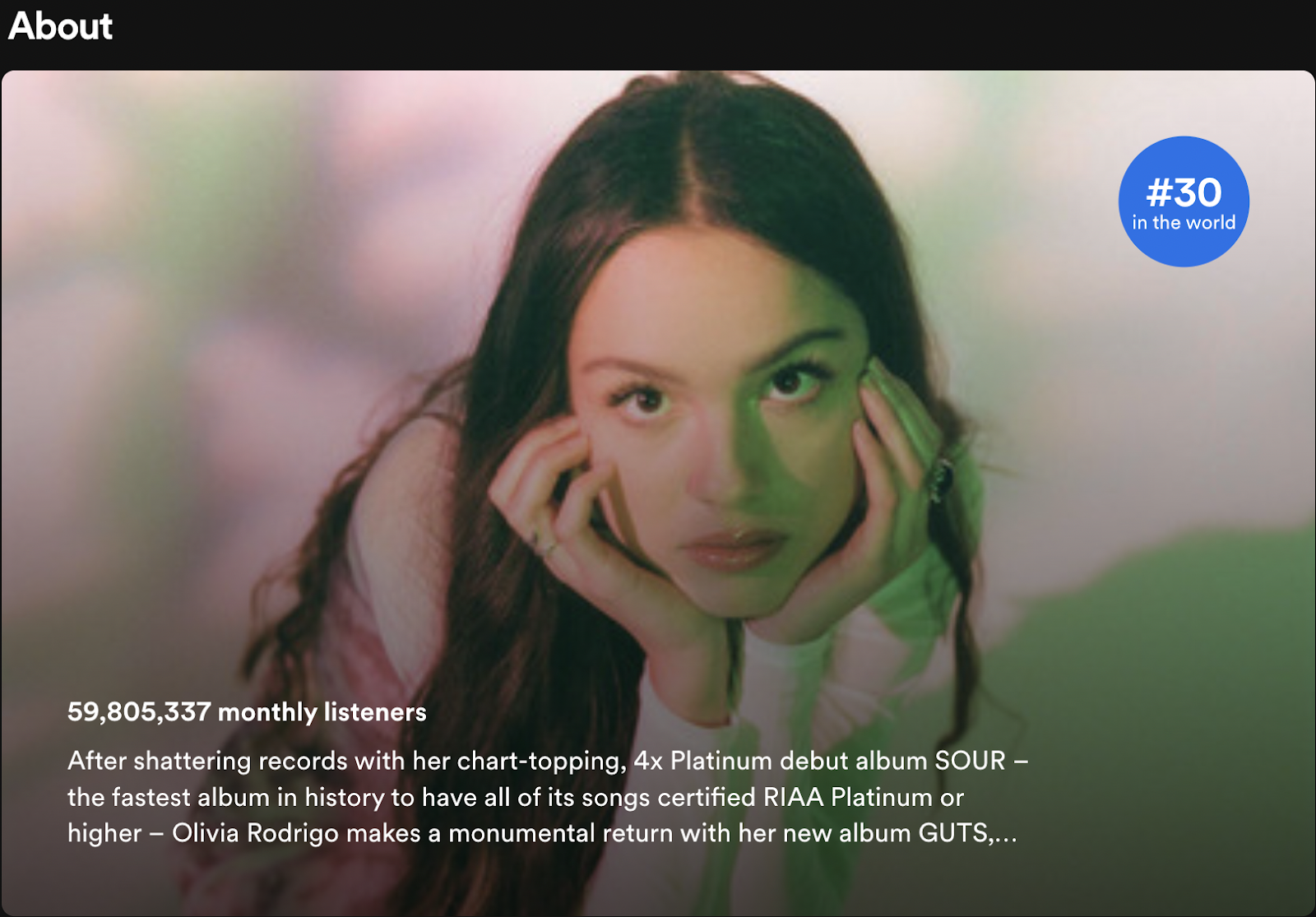
Example: Pop singer Olivia Rodrigo's about section on Spotify, containing similar information to what we want to add in KIARA's back cover.
Example: Pop singer Olivia Rodrigo's about section on Spotify, containing similar information to what we want to add in KIARA's back cover.
Development:
Cover
For our digipak cover, we had taken pictures of our artist KIARA on the 8th of February, when we went to Peninsula Island Park, before we got kicked out of the park. Below are some images of the behind the scenes process of us taking the pictures that we wanted to use in our digipak.


Jasmine posing as she gets her picture taken

We originally decided to experiment with different possible fonts, which we had done on the graphic design app/site Canva. Here is a compilation, made by Sharon, of the different fonts we tried from the designs that she made, where the one we decided fit the aesthetic of the digipak/album best, is circled in green.

After choosing an amicable font, we further experimented with different backgrounds and images that would also look good as a cover. Below are a few designs that we brainstormed together as a team, and thought would also fit well. The design themselves were made by Nayana and Sharon.

Version 1: where KIARA looks at camera, which may be more attractive to audiences due to perceived audience interaction.

Version 2: where she looks away into the sky, which was inspired by the images seen in the research portion of this blogpost. Here her hand gestures combined with a low angle shot connote a sense of freedom as well as power, which we intended to build KIARA's branding as a strong independent artist.

Version 3: where KIARA is with her friends instead of being alone, which could make the album seem more fun and appealing to audiences

Version 4: where we removed the text saying, "The 1st Mini Album" at the top of the cover, instead replacing it with text that simply said "KIARA", after our teacher Mr. Nick gave us feedback in which he told us that it filled up the cover with too much information.
Conclusion:
After creating all these possible cover images, we as a team decided that version 2 of the cover was our best option. We went against the feedback of our teacher Mr. Nick as we believed that the text that reads "1st Mini Album" provided a story to audiences, saying that this is her first ever release. This may build more hype regarding the album, and furthermore from the research we conducted, we found that it was a normal addition to have text at the top of the cover similar to what we did, as per the album covers of various different Asian artists in the K-POP industry. In general, we as a team thought it looked better to include the text than to not, and thus chose to use that version of the cover instead.
Tracklist
For our tracklist, we took pictures on both the 8th of February at Peninsula Island, and the 13th, at Lapangan Renon. We got very pleasing shots of KIARA, as well as shots of scenery, primarily the sky, that we thought would look good as our tracklist. The list of songs itself was thought up by Nayana by looking at other songs from Sabrina Carpenter's catalogue, (the artist behind Feather), as well as creating original songs that fit the general theme of the songs already chosen. Below are a few designs that were created by mainly Nayana, with help from Sharon and Timo as well.

Concept design: which was made with an image Nayana had found during research. We then used this image for inspiration in another one of our designs

Tracklist 1: which uses an image we took on the 8th of February at Peninsula Island, with the tracklist being displayed on a sky blue colored background to the left of the main image

Tracklist 2: which uses an image we took on the 13th of February at Lapangan Renon, with the tracklist being displayed on a leafy green color block to the left of the main image, where we used our concept design as shown previously as inspiration for KIARA's hair and pose, which followed the concept design as we tried to replicate the "flowing in the wind" hair that was seen in the concept design

Tracklist 3: which uses a different picture we took on the 8th of February, but remains similar to tracklist 2

Tracklist 4: which uses the same picture as the one above, however without the blue color block where the songs were listed that we originally intended to have, as our teacher Mr. Nick had given us feedback in which he told us it felt out of place and unnatural.

Tracklist 5: which uses the same image as the one taken on the 13th of February at Lapangan Renon, however this time more zoomed in and without the green color block to the left of the image, for the same reasons that our teacher Mr. Nick had given us previously.
Conclusion:
Overall, we had a variety of different tracklist designs to choose from that looked very satisfactory. However in the end, we believe that tracklist 5 was the best tracklist image that we designed. It was elegant, the lighting of the picture looked beautiful (as we tried our best to take the picture as the sun was setting), and KIARA's hair flows perfectly, similar to the concept design that we originally created. We believe the colors all come together to create a very aesthetically pleasing tracklist that would look great in our digipak, and that audiences and fans of KIARA would also be pleased to see. We also followed the advice of our teacher Mr. Nick, as we agreed that the color block to the left of the image would make the tracklist image look a bit unprofessional and tacky, and liked the tracklist better without it. All things considered, tracklist 5 looked far more appealing to the eye than the other tracklist images, mainly due to the vibrant colors, and the strong contrast with the scenic and picturesque green background, which further provides connotations of summer, and fun, which was the theme that we intended to have throughout the album, as well as the music video.
CD Cover:
For our CD Cover, we intended to have a simple design that did not include KIARA, and instead supported the color palette of the digipak, and thus we thought a scenic landscape picture would look best. Below are a designs that were made by Nayana, for our CD Cover.
For our CD Cover, we intended to have a simple design that did not include KIARA, and instead supported the color palette of the digipak, and thus we thought a scenic landscape picture would look best. Below are a designs that were made by Nayana, for our CD Cover.

CD Cover 1: Which uses an image taken at Pandawa Beach, on the 27th of January

CD Cover 2: Which features clouds with golden rays of sunlight bouncing off them as the sun sets, taken at Lapangan Renon, on the 13th of February

CD Cover 3: Which features bubbles on a green nature backdrop, taken at Lapangan Renon, on the 13th of February.
Conclusion:
In the end, we decided that CD Cover 3 was the design that fit our digipak best. This was because it matched up with the tracklist we chose above (tracklist 5), both having a green/mature backdrop. This is important as in the digipak itself, the tracklist and CD Cover would be in the middle of the digipak, and would thus be next to each other. Having the CD Cover and tracklist be matching would thus look more appealing to audiences and fit in nicer than if we had contrasting colors/themes for the tracklist and CD Cover.
Back Cover:
For the back cover of our digipak, we wanted to include a short message about KIARA, describing her career so far (as was seen in the research regarding the back cover), as well as another picture of KIARA herself, similar to the one in the front cover. For this, Nayana had asked me draft a short description of KIARA, which I did by looking at the "about" section for multiple artists on Spotify. I then drafted the following short paragraph description:
"After rising into the limelight of public attention at the age of just 13, 17 year old Indonesian singer-songwriter KIARA continues to push the boundaries of what the music industry considers feasible. Feather - her newest single - debuted at number 1 on the Billboard Hot 100 in 32 different countries. Hailed by both the public and the industry alike as one of the most creative and inspirational talents of her generation, the end of KIARA's rise to stardom is seemingly nowhere in sight."
I then gave this to Nayana, after which she then created this back cover, using an image of KIARA's back side, which we did to match the cover of the digipak - the front cover showing KIARA from the front, and the back cover showing her from the back:

Initially, we thought this would be a good idea as it gives audiences a short description of what kind of artist and person KIARA is. However, after conducting further research, we had found that such descriptions/excerpts are generally not included on the back covers, or just in digipaks in general. Thus, we decided that it would be better to remove the description entirely, and just settle with having an image of KIARA from the back.
Thus, the final back cover of our digipak became the following image:
Thus, the final back cover of our digipak became the following image:
Reflection:
The creation of KIARA's digipak was a process that originally did not know anything about, as we barely had any idea what a digipak even was. However, after conducting research into digipaks and finding various examples, we were able to narrow down what elements we would need to include in our digipak to make it as good as possible. We then planned out ideas and found inspiration for what we wanted our artist KIARA's digipak to feel like, and began making it. The team worked together as a whole to provide ideas as to what to include in each portion of the digipak, and what changes to make if they were needed. We provided feedback to each other constructively and made changes according to said feedback. Our skills complemented each other well, with Timo taking beautiful pictures, Nayana and Sharon using their design skills remarkably, while I, although could not provide help in the practical aspect, provided creative ideas using the resaerch I conducted mentioning what conventions to follow or stray away from, while also building the overall narrative for what kind of artist KIARA is, and the optimal way to represent her in our digipak, This ranges from helping pick the best photos, deciding what aspects to include in our covers, what fonts look best and match KIARA, and more.
Overall, the creation of our digipak was a smooth process, as well as a great team effort, which faced minimal problems and was a joy to work on with the team.
No comments:
Post a Comment